Discovering the editorial design secrets of a medieval masterpiece
Pardon my ignorance, but I discovered The Book of Kells not more than a few months ago. As a professional in communications and advertising, I feel I should have known about this majesty many years ago. However, that is water under the bridge, and today, I can say that between its illuminations, the intense pagan expressions within a Christian religious context, its history, and what we have lost of it that leaves us wondering, I was hooked.
In front of me was a chimera, the perfect example of what has triggered a timeless question: what is art?
Before I go on with my excitement and expose my opinion on what or what is not the Book of Kells, let me tell you about it.
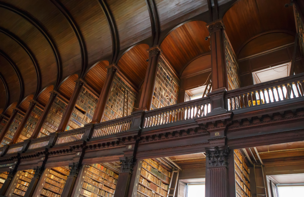
The Book of Kells is the most famous of the medieval illuminated manuscripts. It’s currently located in Trinity’s College library in Dublin and available for online preview here. However, if you need a reason to visit Ireland beyond the leprechauns, Brian Boru’s harp, and their whiskey, you just found it.
The three words used to describe the Book of Kells—Medieval Illuminated Manuscript—tell us a lot about it. Medieval already creates a timeline: the Middle Ages. We are talking about a book that is believed to have been created around 800 CE, meaning many years before Gutenberg. So, it’s a handwritten book, a manuscript.
Lastly, illuminated. Illuminated manuscripts had decorations and illustrations. They were called illuminations because of the materials used to paint them–gold and silver, which, accompanied by other rich colours, made the page literally shimmer.
What’s in the book that makes it so iconic?
The various expressions of the early medieval ages in Europe were inspired by the amalgamations they were experiencing. A soup of diverse ingredients that included the Roman Empire heritage, the early Christian Church expansion and everyone else who wasn’t part of the ancient self-proclaimed Great Nations (I refuse to use the common name given to everyone else who didn’t speak Greek despite they were even more civilized and educated! Rant over.)
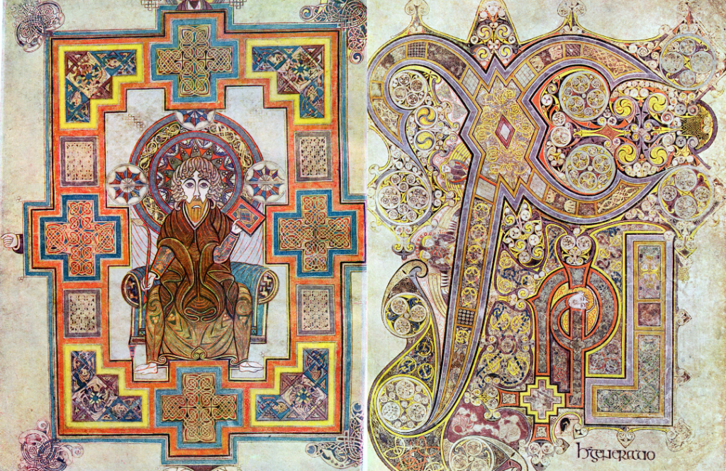
The Book of Kells is not an exception, as it contains the four gospels of the Old Testament. However, this is when things around the Book of Kells turn really interesting, as the book itself tends to be described as a Celtic Gospel Book. The reason behind including the word “Celtic” in a Christian religious book is why the book itself has gained much attention and is the backbone of its uniqueness.
The Book of Kells is a really old manuscript, and that only makes it a masterpiece of Western calligraphy. However, along with the exceptional lettering, there are decorations expanding the impact of each one of the carefully and beautifully handwritten pages. Those are called Insular Art, a Celtic artistic tradition that mainly focuses on intricate lines and simple geometric figures rather than figural shapes that create patterns.
In some cases, the illuminations are massive and take up full pages, making the written word a secondary element of the piece. Page after page, the impressive details of the incidental illuminations surprise more and more. To put things in perspective, on some pages, the intricacy of the lines is so amazing that researchers wanted to look at them closer. Using a technology not available at the time the book was written—a magnifying glass—they found 158 lines interlacing in one square inch!
The detailed work seen in this book, not only in the illuminations but from the scribers (someone that handcopies manuscripts) with the design and execution of lettering, plus the length of the book hints that it took years to be completed. In fact, after careful analysis is believed that three illuminators and four scribers worked on the piece across the years of its creation. This makes a lot of sense when you learn that the book has 340 folios, and it seems to have been started at Iona and moved at some point to Kells, and who knows how many other places.
However, the size of the team behind the Book of Kells will remain unknown, as is currently believed that 12 folios have been lost, plus the cover and other pages that lived a few other dramas ending in them getting damaged or destroyed in wars, monks’ travels, relics trafficking, bookbinding, murder (yes, I just wrote murder,) and theft in 1007 CE and “again” in 1874. I know! But honestly, you couldn’t expect less of a book wandering around for 1200 years. Now, back to the topic.
Is this art?
Well, let’s go back to the illuminations. In the gospel of Matthew, folio 114, something fascinating happens. The insular art that ruled the core of the book’s decoration kind of evolved when the geometric patterns and interlaced lines became things, characters, and animal-inspired shapes that responded to the content written on the page.
Although the book contains several illuminations of the Madonna and Child, Christ, and the apostles Matthew and John, they were there to decorate the teachings of Christ from the perspective of his followers. It is only in this part of the book that illuminations started to communicate concepts and aid the consumption of information. In other words, the genesis of editorial design in the Western world.
At this point, from my perspective, the illuminators became the graphic designers of Medieval Times. This is also serendipitous now that William A. Wiggins, who coined the term graphic design, was a typographer.
The emergence of editorial parts didn’t end there. In a later illumination, on folio 214, the third temptation of Christ by the devil inspires the illumination. What you can see is a representation of the scene with 2 guards apprehending a huge Jesus. But the interesting thing about that illumination is that there is a pull quote!
“After singing a hymn, they went out to the Mount of Olives”.
Matthew, chapter 26, verse 30
Why is this so gripping? Because, editorial design is a branch of graphic design specialized in publications, such as books, magazines, newspapers, brochures and so on. The magazine layout elements came to be way later in time after the massification of printing by the end of the 15th century. The first magazine in the Western world that we have a record of is a general interest magazine that was created in 1663 and ran until 1668—Erbauliche Monaths-Unterredungen. By then, the Book of Kells had been existing on Earth for 1,000 years!
Does this mean that the Book of Kells is a design piece?
Illuminations and graphic design have the same goal: to create a visually appealing piece that points readers and viewers to certain information. The more figurative illuminations, in particular, join the functional purpose of design, which is to help understand a concept and to make it clearer and more interesting.
Art, on the other hand, drops all the functional characteristics and focuses on provoking thought and emotion.
Despite Celts’ artistry is recognized for being exceptionally functional and practical, there is no way to deny that within its abstract design and geometric patterns, the soul gets entangled, and emotions flourish.
The reality is that I don’t have a solid answer. The Book of Kells is, for me, as I mentioned before, a chimera—a creation composed of different parts and sources. It’s neither just a book nor a piece of art, neither design nor mere artistic expression. The book exists to question us and mesmerize us, to remind us that there is no right or wrong, good or evil, and there is no light or darkness without the other one.
The Book of Kells, is. And I loved this ride!